
Ponder AI
2025
Building Narrative Gravity For A Pre-Launch AI Startup

Viral Marketing, Branding
PROGRAM
-
Adobe Premiere Pro
-
Adobe Photoshop
-
Adobe Illustrator
SKILL
-
Creative Direction
-
Video Editing
-
Production
-
Graphic Design
-
Marketing
I was brought on to kickstart branding and marketing for Ponder AI before the product was ready to be shown publicly. There was no official demo to rely on, no feature set to showcase. The goal was to build awareness and credibility while the product was still being built.
I worked closely with the founder to define the brand voice from the ground up. I wrote, produced, and directed an introduction video centered on his personal connection to the product and the deeper purpose behind building it. The tone was intentional. Humorous but thoughtful. Light enough to be shareable, but layered with insight. It needed to resonate with AI-native audiences on X, early-stage investors drawn to young technical talent, and creatives curious about new tools.
At the same time, I refined and developed the brand’s logo to establish a clear visual foundation. The mark became the anchor across all platforms. It is the first touchpoint investors, creators, and early users encounter when discovering Ponder.
This phase was about building signal before launch. Establishing voice, tone, and visual consistency so that when the product enters the market, it enters with identity already intact.


RESULTS
-
30,000Views
-
550 Likes
-
65 Comments
"I Am Building Ponder Because of A Girl" Ponder AI Intro Video
Logo Corrections
CORRECTIONS
-
18 radius for all curves
-
0.67 inch width between each element

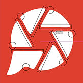

The original logo concept was strong, so I chose not to reinvent it but to refine it. The mark combined visual cues from a messaging app and a camera aperture, arranged to subtly form a “P” for Ponder. The idea directly tied back to the product: communication, content, and video editing.
However, the execution lacked consistency. The curves and edges were misaligned, which became especially noticeable at scale and across different platforms. Since this logo would be the first touchpoint for investors, creators, and early users, precision mattered.
I rebuilt the mark with consistent geometry and cleaner proportions while preserving the original concept. From there, I expanded the system. The founder was interested in adding more character and texture, so I explored both 2D and 3D metallic variations in Illustrator. The flat 2D version became the primary logo for clarity and scalability, while the 3D metallic renders were developed as expressive assets for social, and personalized applications.
Original Logo
Proposed Corrections
Final Logo
Black Logo Variation

White Logo Variation
Metallic Logo Variation

3D Metal Render V1

3D Metal Render V2

3D Metal Render V3
